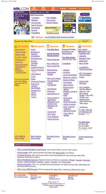
And after stopping to compare the designs, it's a new footer--previously, we used the same nav bar for the header and footer; with this design tweak, we bagged the footer nav bar (if they made it that far to the bottom of the page, clearly they were looking for something else), replacing it with an "Other AOL Sites" section, with 11 corporate and other utility links.
Below that, is the standard legalese block; I'm pretty sure I pasted the footer bit from the dev server version of the page, since the stock art in the top of the page clearly wasn't an AP photo:
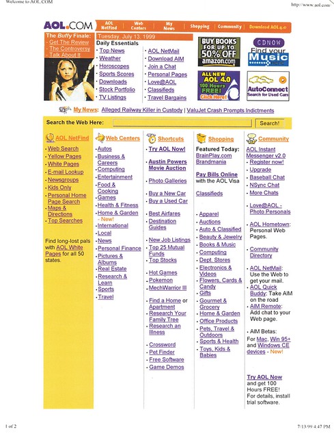
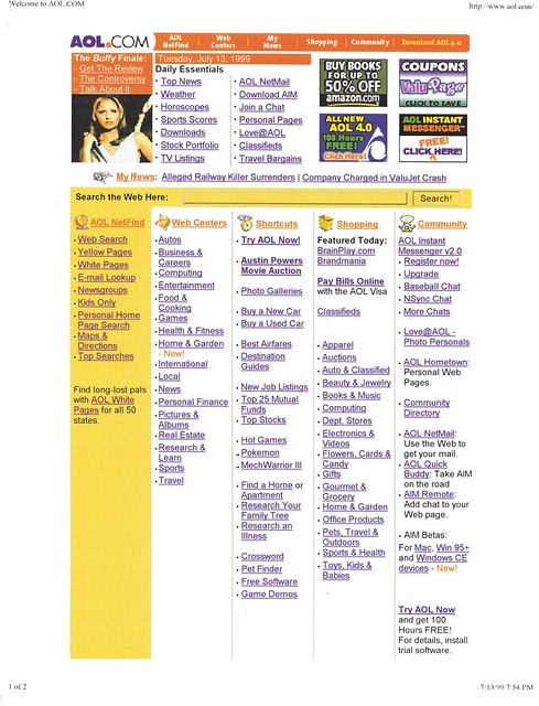
For the PM update, we went back to the Buffy the Vampire Slayer Season 3 finale, since this was the actual broadcast night. I have two screenshots taken 2 hours apart, though I can't see any difference between the two versions:
[Series note: In the late 1990s, I programmed the content for the AOL.com home page, which relaunched with a new design on July 14, 1998. I printed screencaps and saved them. 20 years later, I'm scanning them in and posting them with a little commentary under the tag #20YearsAgoOnAOLcom.]


No comments:
Post a Comment