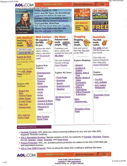
More importantly, this is one month after the July 14 relaunch, and where we introduced some design tweaks (that I'd forgotten about until I was scrolling through the August photos and saw some differences):
Here's an animated gif that makes the differences easy to spot:
- First and foremost, the AOL Netfind search bar below the main promo block (and that previously spanned the top of the five columns) was moved to the AOL Netfind column, which also received a background color to make it stand out more.
- We added bolded "Explore [Product Name]" headers above the static list items below the fold, and also made them unordered lists with red bullets.
- You can also see horizontal dividers between the different column sections. Apparently, we were concerned that people were ignoring the column content.
- We made an odd font choice, where the column header and promo content was a serif font (probably Times Roman), whereas the list items remained sans serif. It might have just been an artifact of how we published the promos via the promo rotator tool. It looks ugly as hell.


No comments:
Post a Comment