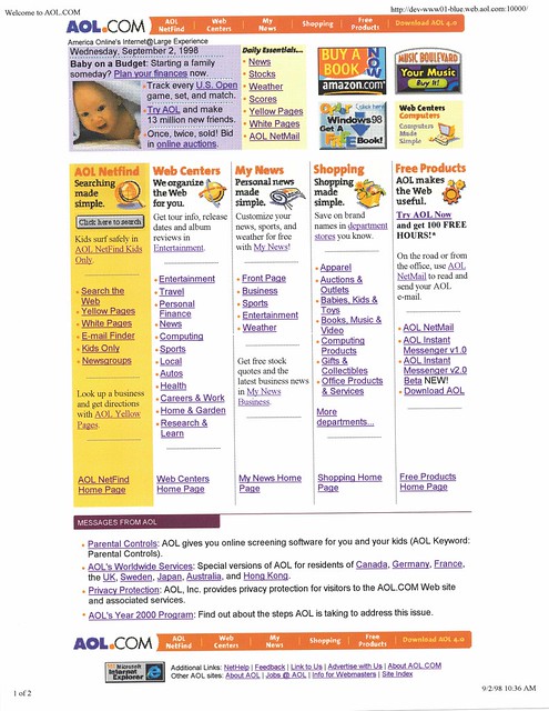
* First, we broke out the Daily Essentials to their own column (which almost, but not quite aligned to the five-column layout below... man, what were we thinking?).
* More importantly to me, if you look at the baby promo, this is when we switched to a text headline for the graphic promo, instead of embedding text into the graphic. At the time, it wasn't for SEO: It was for production flexibility and decreasing turnaround time. This had been a battle I'd been fighting for some time (after all, I was the person programming the spot), and I remember our West Coast design lead, Phil Waters, who had been an advocate for the designed graphics, finally sending in an email something like "I have seen the light!" (it might have even been in all caps).
This gave us a lead promo with a graphic and two lines of text, and three all-text promos (that added bullets, but removed bolded headlines). The narrower columns really cut into my available character count.


No comments:
Post a Comment