For the morning lineup, the top promo is the same My Calendar promo we'd used before, with a "Be Fiscally Fit" item for good measure.
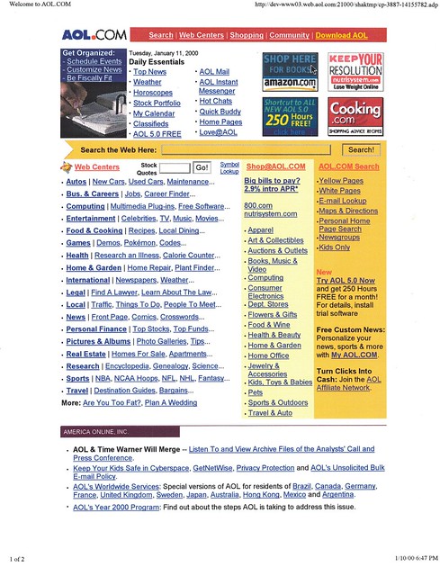
However, if you look below in the corporate links, you'll see, "AOL & Time Warner Will Merge -- Listen To and View Archive Files of the Analysts' Call and Press Conference." The AOL Time Warner merger (*cough* acquisition) was actually announced January 10 after market close, though I only had a preview of that page. But I guess that's as good a one as any to close on:
But Wait, There's More!
I was all set to end this on a pretty anticlimactic note. But then I was in my office looking for something, and found the reason why I stopped screenshotting the home page: It was because Tuesday, Jan. 11 was the launch of our new redesign! And I have full screenshots, printed on ledger paper, from launch day!
I say "screenshots," because there are two versions of the page: a non-logged in view (including external browsers... that is, browsers not integrated with the AOL client); you can tell it's the non-authenticated view because of the AOL screenname and password fields, which were real, functioning fields:

And a logged-in view. At least, I think this is the logged-in view. I may have my timelines mixed up, but because we started really integrating AOL Mail into the homepage, and getting identity information from the AOL client, that's when the member and non-member (or non-authenticated member) views of the page really started to diverge:
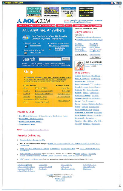
The external view of the homepage, which included people using external browsers -- non-AOL members and AOL members who hadn't signed in with their AOL credentials -- would eventually feature big, billboard style TRY AOL 10 ZILLION HOURS FREE ads that basically replaced the top half of the right column. But I don't remember if we launched with that here. (Unless these screenshots were doctored [which is always possible], these were screenshots using the AOL client browser -- you can tell because of the AOL Favorite Places heart in the upper right corner.)
I seem to remember that we made you enter your screen name and password to access your AOL Webmail, even from within the AOL client. Some time later, we made it so that if you were using the AOL client's browser, it would automatically identify and authenticate you into AOL Mail with the screen name you were using. Convenient, right? NO! The users howled at us, because we hadn't taken into account the following use case: AOL members, logged into their AOL client, using AOL.com and AOL Webmail to log in and check the mailboxes of their other AOL Screen Names. (They could have five, later seven, total screen names.) For them, AOL Webmail was their way of easily checking mail from other their accounts, without having to log in and out of the client. Lesson learned.
Anyway, you can see the other major design changes:
And, down below, you can see a link to a note about the redesign launch, as well as the item about the merger.
I seem to remember that we made you enter your screen name and password to access your AOL Webmail, even from within the AOL client. Some time later, we made it so that if you were using the AOL client's browser, it would automatically identify and authenticate you into AOL Mail with the screen name you were using. Convenient, right? NO! The users howled at us, because we hadn't taken into account the following use case: AOL members, logged into their AOL client, using AOL.com and AOL Webmail to log in and check the mailboxes of their other AOL Screen Names. (They could have five, later seven, total screen names.) For them, AOL Webmail was their way of easily checking mail from other their accounts, without having to log in and out of the client. Lesson learned.
Anyway, you can see the other major design changes:
- The colored block sections, of course. We really gave Community features short shrift here (though to be fair, many of those features weren't yet available outside the AOL client)
- "AOL Anytime, Anywhere" branding (we'd later rebrand the site to be "AOL Anywhere," per executive whim.)
- Four small ad spots up top-- four times the impressions compared to a single banner ad! -- except that when they showed duplicate ads, it really looked like a slot machine jackpot payoff
- A text ad above the top nav bar
- The My News news feed headlines up high
- An auto-generated date field (removing at least one potential source of human error)
- The new, ridiculous postage-stamp sized promo block. Seriously, that was basically it, and it was a weird, non-standard size. I think 63x63?
- The Shopping block went from categories to brands.
- The super-truncated Web Centers listings.
And, down below, you can see a link to a note about the redesign launch, as well as the item about the merger.
Closing Thoughts
So, to wrap things up: Publishing the home page was a grind (in addition to doing a bunch of other things for the AOL.com site that I'm sure were very worthwhile), and doing this series of blog entries and Twitter posts brought back a little of that. I specifically scheduled the blog posts to publish at 3AM ET, because that's when the AOL.com promos updated for each new day.
I could have gone more under the hood, talking about Shark and Shakespeare, promo rotators, push tools, include files, staging servers, tracking redirects, etc, but you get the picture.
I could have gone more under the hood, talking about Shark and Shakespeare, promo rotators, push tools, include files, staging servers, tracking redirects, etc, but you get the picture.
I'd continue to do the home page for a year or two more, through a few redesigns and aborted launches (two in a row, including one that was ahead of its time, with integrated AIM Express Buddy List right there on the page!). We did more segmentation (in-client and out-of-client views), though they didn't go to dynamic programming and more dayparts until after I switched groups.
I may have other screenshots tucked away on hard drives or CD-ROMs (some of which I can't get to anymore), though I think this is it for the hard copies. I'm pretty sure I have a 9/11 screenshot somewhere, too.
Anyway, here we are, 20 years later. I hope this archive is useful to someone, even if it's just for nostalgia purposes. For me, it was part memory job, part writing prompt to get me posting online again. So we'll see what happens with that.
[Series note: In the late 1990s, I programmed the content for the AOL.com home page, which relaunched with a new design on July 14, 1998. I printed screencaps and saved them. 20 years later, I'm scanning them in and posting them with a little commentary under the tag #20YearsAgoOnAOLcom.]


No comments:
Post a Comment