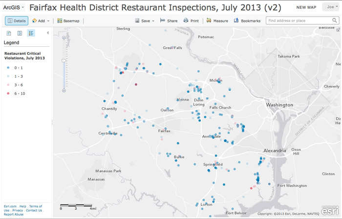
For my final map project in "Maps and the Geospatial Revolution" -- a massive open online course (MOOC) from Coursera -- I made an interactive map visualizing the results.
Click the screenshot to view the full-size interactive map, or scroll down to see an embedded version and read more about how and why I created it:
Results of 334 Fairfax Health District Restaurant Inspections, July 2013
Finding the Data
The Virginia Department of Health uses HealthSpace, a Canadian company with a US subsidiary, to publish its restaurant inspection results.It's not particularly user-friendly. There's no site-wide search -- you have to first know the locality you want. (Note that the Richmond Times-Dispatch already has a searchable Virginia restaurant inspections database that pulls from the same data, so my version was just a learning exercise.)
Once at the proper locality, you can search by restaurant name. You can also browse the list sorted by inspection date, though it's easier to view just the frame showing the results (adjusting the count and start attributes in the URL to approximate date ranges as needed.)
For my map, I scraped the data manually (and painfully, with a lot of clicking, copy-and-paste, and search-and-replace) from the Web site; added city names; converted the street addresses to latitude and longitude using a web tool; then added violation counts, the July inspection report, and the URL of each restaurant's facility inspection history record. Then, I exported everything to a CSV file that I imported as a layer in ArcGIS Online (where I have a free public account).
Next time, I'll use a scraper. (Note: Learn how to write a scraper.)
What You're Seeing
The restaurants are represented by circles, with graduated colors showing the number of critical violations for each restaurant. The color categories are divergent, following natural breaks: Bluer symbols have fewer critical violations; redder symbols have more critical violations; and neutral colors represent the average.Clicking each symbol will pop up a window showing the restaurant's info and number of critical and noncritical violations from its most recent inspection. Also, clicking "More info" will link to that restaurant's facility inspection history (where you can find the results of previous inspections).
Scrolling down will show the full report from the July inspections -- the line breaks and formatting got lost along the way, so they're a little hard to read.
(This version of the map incorporates feedback I received during the peer review process -- the basemap uses a simple gray background which makes the circles easier to see than with the satellite image basemap I used before.)
Final Notes
Note that any single inspection is just a snapshot of that restaurant, so check the inspection history link to get a fuller picture.Also, "critical" violations can cover everything from handwashing failures and rodent droppings, to lacking an onsite Certified Food Manager or menu labels warning about the health hazards of undercooked ingredients. (See more info about critical and noncritical violations, and a FAQ about the inspection process.)
Government transparency and open government are other interests of mine, so this was a chance to try my hand at taking government data and visualizing it into a map. Nothing as fancy as what you might see presented at Transparency Camp (there are much fancier story map templates, but with 334 results and not a lot of time, I stuck with a basic visualization).
Lastly, since I did everything by hand, don't expect any future editions. (Check the Richmond Times-Dispatch if you want to search for a particular restaurant.)


1 comment:
Neato.
Post a Comment